Learn about the new Box update and its many enhanced features, including a new all-file navigation layout, faster upload speeds, and much more.
Box has released an update that includes improved functionality and user interface. The new experience includes an all-new file navigation layout that better uses your screen real estate and provides more convenience, enhanced responsiveness, more customization and better keyword-less searching. The new experience also loads up to 30% faster and has as much as a 5x increase in upload speeds through the web app. Check out the new changes listed below or watch this introductory video and give the new experience a try!
What Has Changed?
The basic layout has changed so that more information is available on the screen at any time. No matter what the size of your window or what device you view it on, the new experience will make navigating Box effortless.
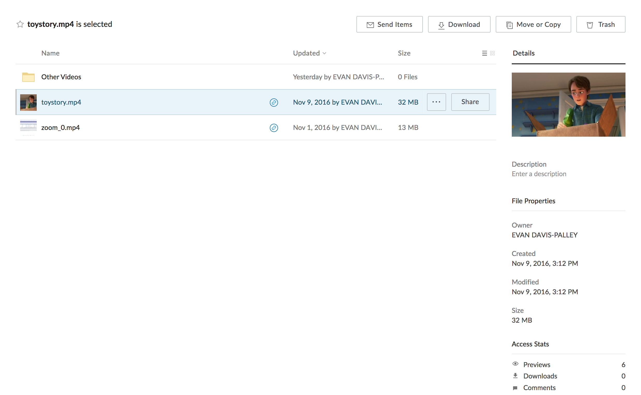
- Files can now be selected in the file browser without previewing them, to see their descriptions, share them, move them or delete them.
- Keyboard shortcuts Ctrl + C, Ctrl + X, Ctrl + V can now be used to copy, cut and paste within the Box web application.
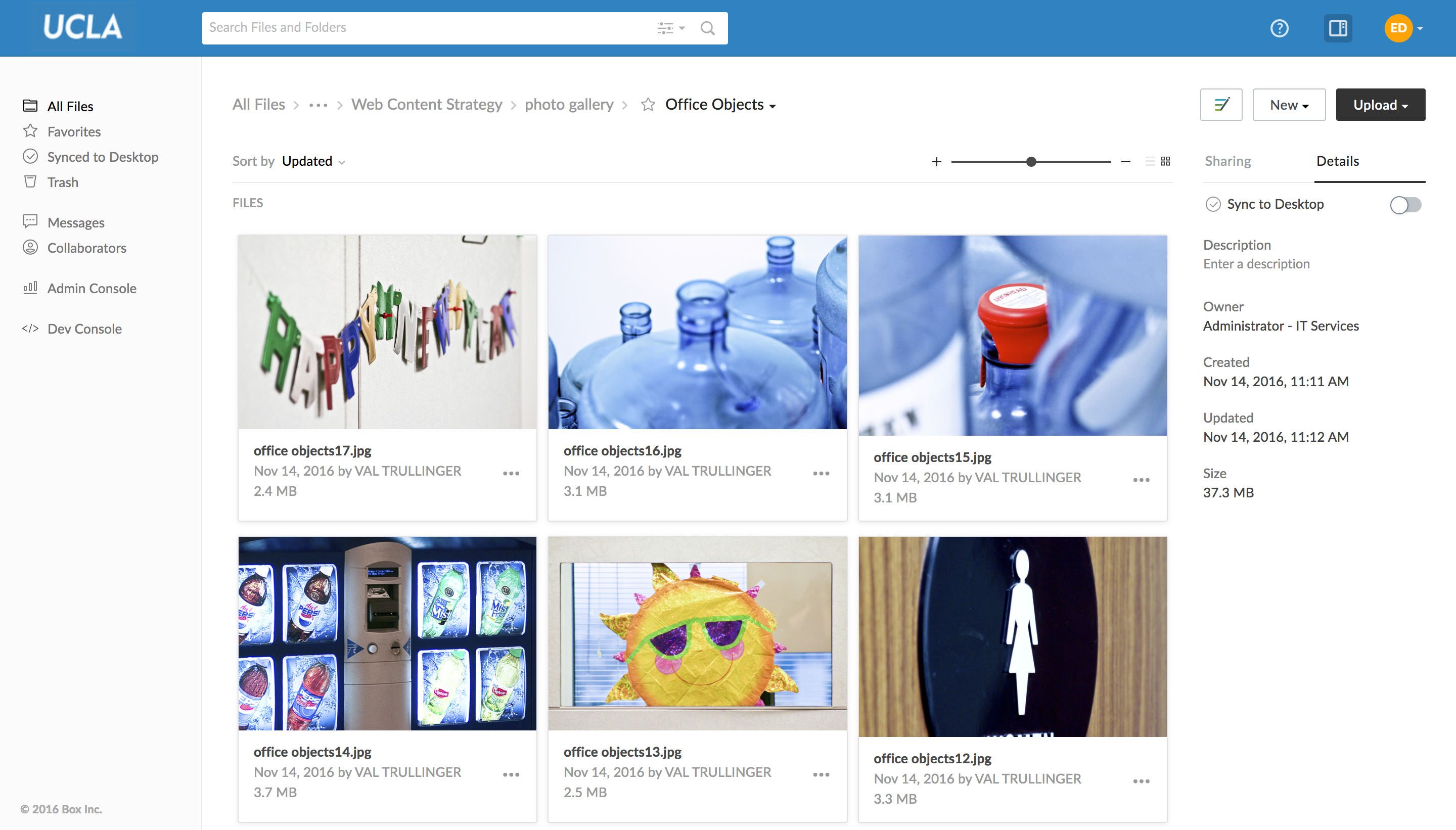
- Quick navigation links to Favorites, All Files, Synced to Desktop and Trash have been added to the left of the screen for fast and easy navigation within your Box.
- Upload, New, and Notes have been moved to the top right, and file Name, Updated date and Size are now consistent in a column:

Folder details can be viewed from the file browser by selecting Details below the upload button, so you don’t have to wait for the file to open in preview to see the information about it:

Options for sharing a folder are clearer than ever, with shared link and invitation to collaborate being consolidated under the Share button:

The "more" option, which was previously a three-dots button on the top right, has been added as a dropdown box to the name of the file in preview. This is more intuitive, as the option is essentially a right-click menu for the file in question. Now you don't have an extra button just to see the file options:

Account Settings now has a General Options section that includes the following options:
- Home Page: You can now choose to change your Home Page to Favorites for further organization of your Box experience.
- Options from the General tab in the old experience, including: Items per page, time zone, and language.

- Email notifications have been moved from Notifications in the old experience to Sharing in the new experience.
- Icon View has been renamed Grid View and is easier to access. In addition, it allows resizing of icons for larger previews in high resolution:


